Welcome back to another Sugar Series Editorial Shoot! This week, we’re chilling in our pajamas and grabbing our quick, colorful, morning favorite: cereal!
I personally, just discovered this AWESOME Captain Crunch cereal that turns your milk green (just in time for Halloween):

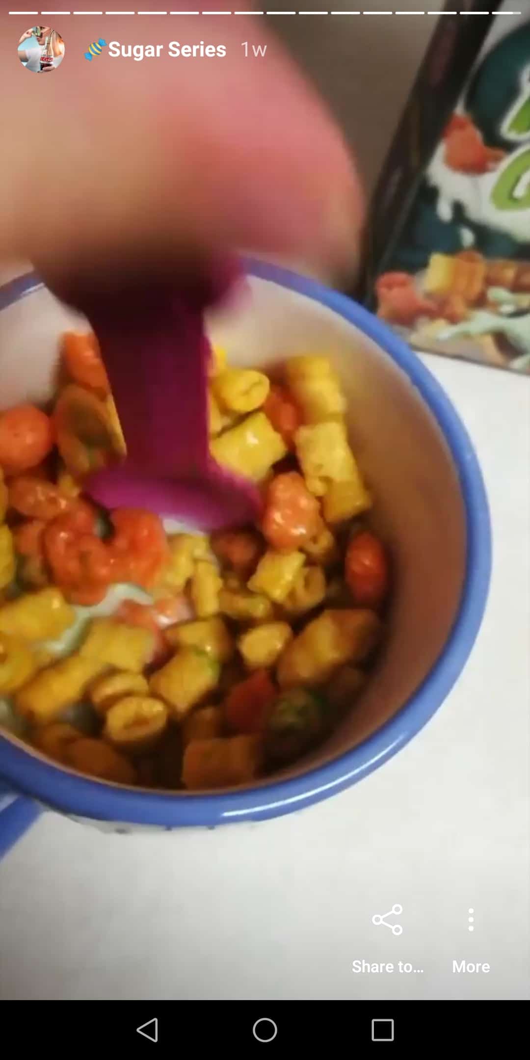
But this Cereal Photoshoot was all about fun, colors, and scrunchies! So let’s dive into this shoot!
Gel’s in the Front, Party in the Back: Adding Color in Camera
So, in the lollipop shoot and this cereal photoshoot, you’ll see I used a technique where I am bringing color into the photo in the foreground.
 I was actually inspired by another photographer, Cas Carlson, who is an AMAZING photographer (love her work—go check it out). And I noticed in some of her images she brought a translucent-like shape of color into the image coloring overtop everything. And so I thought to myself, “How does she freaking doing that?!”
And that’s when it clicked: gels (of course—because I love gels)! So let me share how I accomplished this look with my gels in this cereal photoshoot.
Bringing Gels Close to Camera: How Does It Work?
I am going to use this image of Hannah with the blue in it as an example:
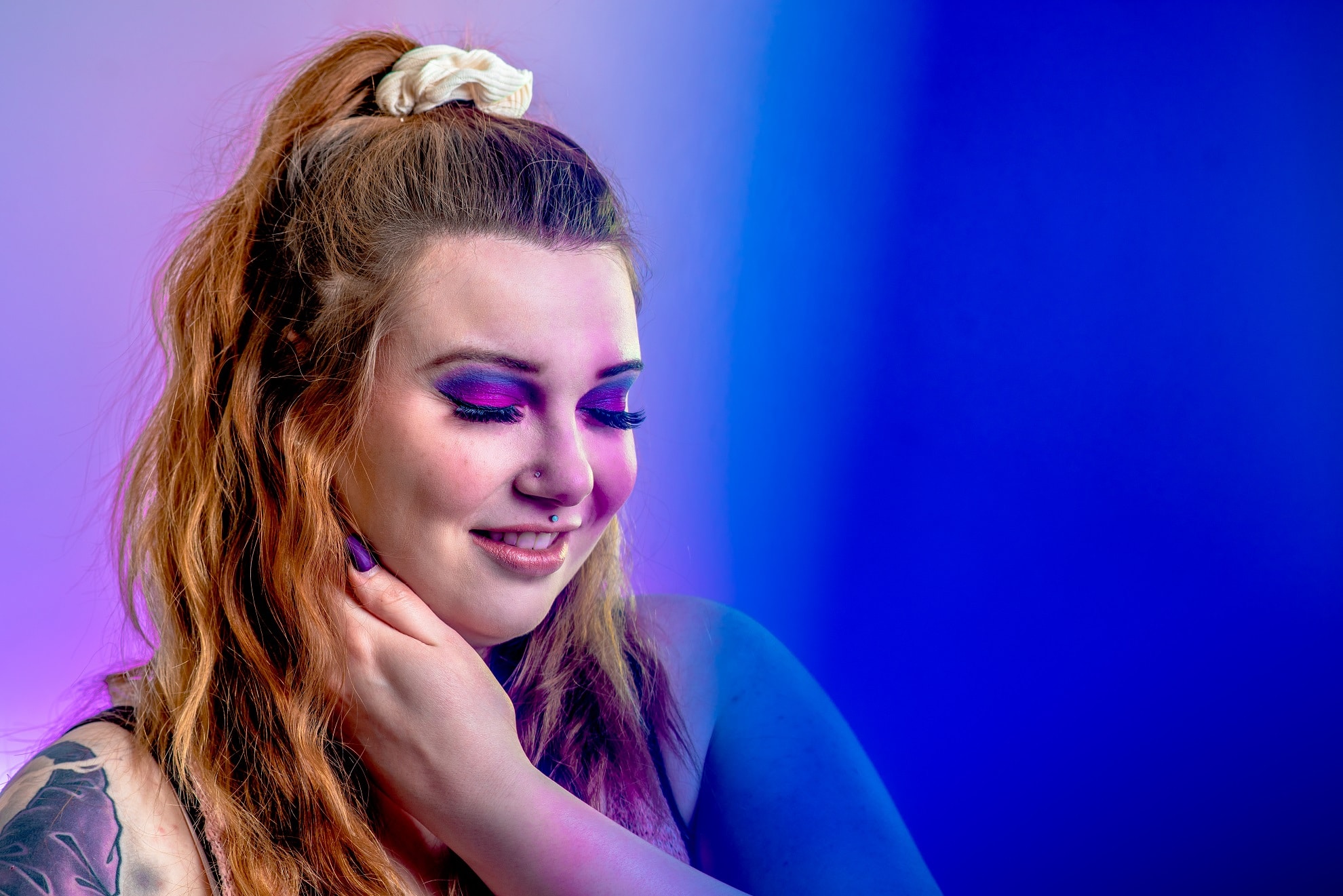
 If I take a blue gel (which would normally go on a speedlite) and place right in front of the camera you can see how much color it adds over the scene.
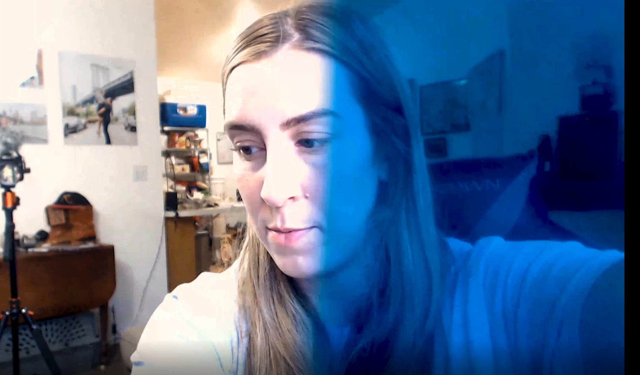
This color becomes a softer transition in camera when you bring it closer to the camera, due to the large aperture. Because the depth of field is shallow, that same blurred “bokeh” effect can occur with the edges of the colored gel.
In this Cereal Photoshoot, I used a combination of gels on speedlites and gels close to camera to create different bright coloring in the background and foreground.

Consistent Editing: Process and Flow for the Cereal Shoot
So, how do I edit all the different colored cereal photoshoot images so they feel consistent, yet best emphasize the colors in the shot? It’s all in the process.
General Processing in Lightroom, Detail Retouching in Photoshop
 I start by doing most of the general processing in Lightroom. Lightroom makes it easy for me to find something that I look for the different lighting set-ups I’ve done, compare the editing side-by-side, and then copy those settings to images in similar lighting. All that’s left then is little tweaks for variations in the images.
From there, I’ll take the images into Photoshop and focus on retouching the little details (like pores, hair, hairline, specific coloring on parts of the face, etc). This allows me to be editing a fairly consistent image from the start, and then apply edits that I can make to just specific areas of the image. Photoshop allows more control over the opacity and blending of these edits and I can separate them out on different layers if I want to reflect them on other images.
I will sometimes still pull edits across multiple images from Photoshop by copying the layer where I did the edits, onto other images. Again, this helps me maintain consistency across the set of images so it really does feel like a set.
Matching Coloring to the Make-up
A great photographer should help make the MUA’s art pop! So I love to look for ways to help bring out aspects of the make-up, including the beautiful colors!
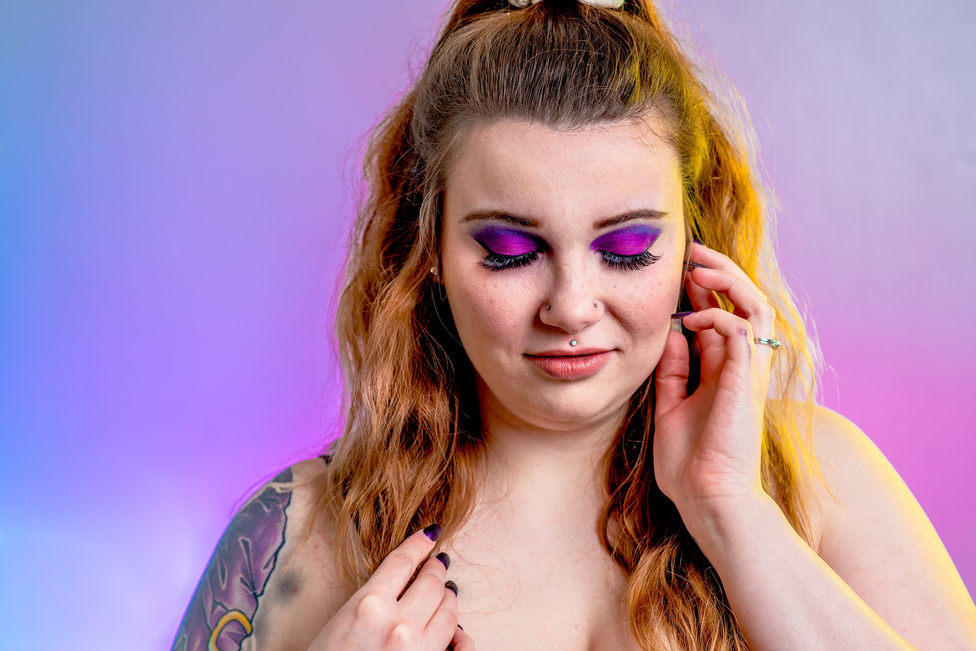
 Here the Utah-local Makenzie Dodge (with Phoenix Artistry) used purples for the cereal and to compliment Hannah’s skin tone. You can see a combination of both cooler and warmer purples—one with more blue in it and one with more pink. I thought if I could help reflect that into the scene with the background, that would help tie the entire visual story together.
You can see in this image, that I have my handy dandy speedlite on a gel aimed at the wall to create a colored background. In this instance, I actually took it a step further though and used two colored gels on the speedlite so that I would have a gradient of purple from blue, to purple, to pink to match the eyeshadow.
I also played around with different gels being brought closer to camera, as talked about earlier in the article.
Coloring Considerations in Post-Processing: Matching Brightness and Color in this Cereal Photoshoot
The biggest aspect that many overlook when using gels to bring out colors in an image—is the post-processing toning! They don’t think about making this match in luminance (brightness) and tone (color).
In my post-processing flow, I do the fine-tune tweaking of the tone and luminance of the gel and the make-up in Photoshop. That is because I have more control over where I can mask, and to what degree I can apply the mask.
Colors, colors, and more colors! Check out more images from this bright, bubbly Cereal Photoshoot
I love all the colors in most cereals (although all the color dyes I am consuming I just won’t think about). This cereal photoshoot here in Utah was honestly a blast! Check out more images below in the gallery, and feel free to reach out to me if you want to schedule a fun, colorful shoot for yourself!


