Choosing outfits and color schemes is not always the easiest task. To help you get the most out of your photo session, I’ve put together a guide to help you plan and coordinate your outfits for your Lucy L Photography photo session.
Choosing a Color Palette
Let’s start at the top–choosing your color palette! Starting off with the right color scheme will help you portray yourself and other members of the photo shoot in the best light. Let’s take a look at what to consider when choosing a color palette.
Click here to check out sample color palettes I recommend for your photo session.
Consider Location: Where Are You Taking Pictures & Where Will They Be Displayed?
If your photos will be hanging in a certain area of your home, more neutral colors may be preferred. If you have a bright blue wall, maybe toned-down blue with a pop of yellow may fit better. I always suggest neutral tones so you can display your pictures in a variety of settings.
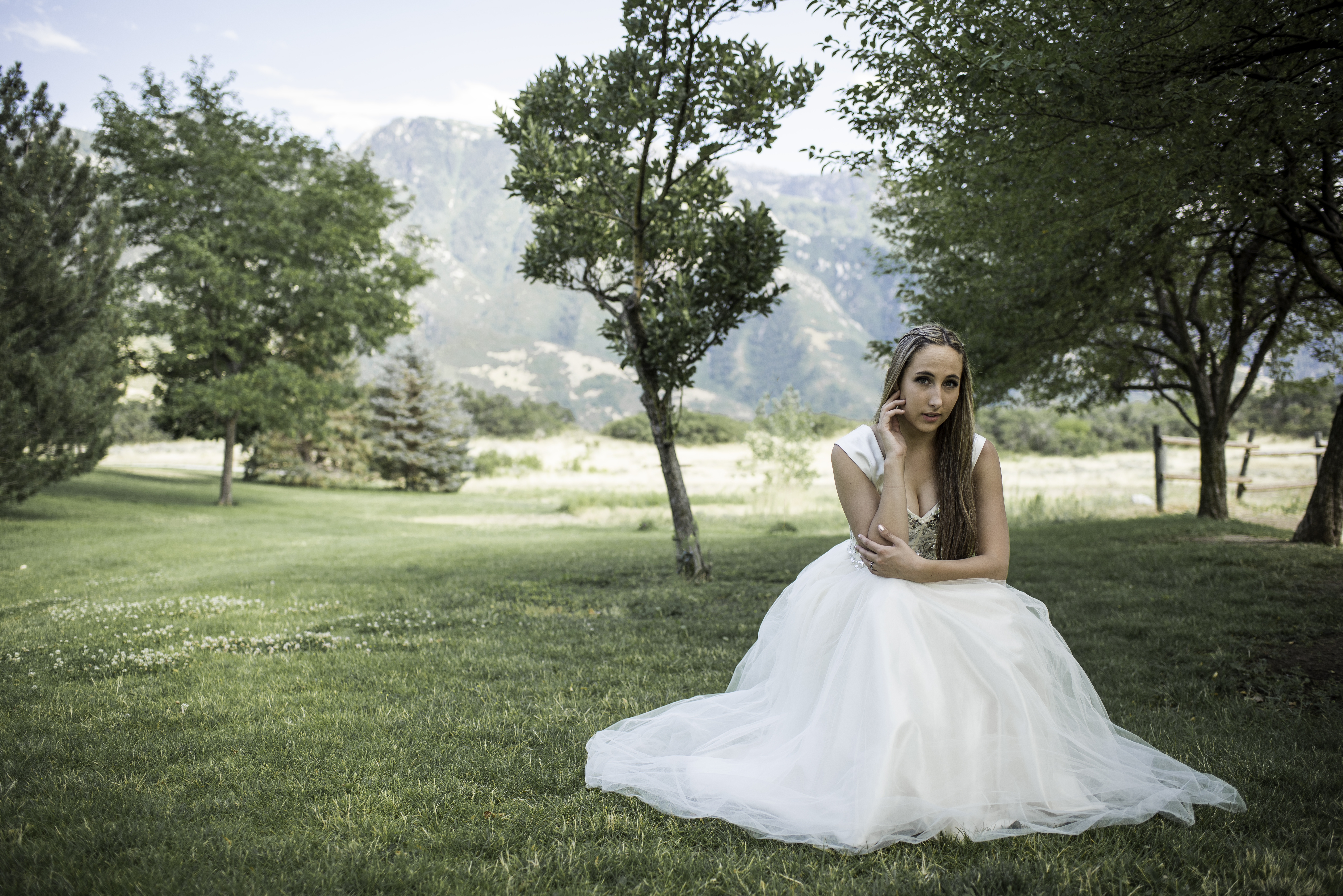
Think about your location. Avoid wearing colors that would blend in with your surroundings. If you are going to be in a lush, green setting—I would recommend avoid greens that would make you one with the plants. If you are in a metallic, cityscape—a darker color will really make you pop against the buildings.
Avoid Bright Colors
As fun as highlighter yellow or pink is, a professional photo shoot may not be the best time to pull these colors out. Not only will these colors draw attention away from your faces, but they also tend to reflect a color cast onto your skin. Color cast is when the light reflects off of your clothing/surroundings, and then bounces back so that the light and color is shown on your skin. Below is an example of color casting:

I recommend avoiding neon colors in general, and when choosing lighter colors lean towards more pastel (or grayed out) colors. Pastels tend to enhance natural skin tones.
This doesn’t mean everything has to be neutral, but a beautiful egg-shell blue is grayed out enough it won’t bounce blue back onto your face. Avoid bright pink tones—pink can be very reflective and tends to take away from beautiful natural skin tones (pale to dark).
Add Accent Colors for a Punch

Choose accent colors that complement the color palette chosen. Use these to add a burst of color and personality to your color scheme.
I recommend pulling color from existing designs or color schemes within clothing. Often times it is best to start with female clothing and base the rest of the outfits around that.
Choose Between Warm or Cool Tones
Determine if you have warm or cool undertones in your skin, and then determine whether warm or cool tones best complement you and other participants skin the best. (To learn more about how to determine your skin undertones, check out this blog post here: http://stylecaster.com/cool-warm-skin-undertones/).
Based upon your skin undertone and the time of year you are taking/sharing pictures, you may want to lean towards a more warm or cool color palette. Typical winter pictures tend to have more cool toned-color palettes, and fall tends to be warmer. However, most seasons you can adjust to either palette. Summer is a perfect example with peaches and yellows for a more warm, sunset tone and cool aquas and greens for a beachy, cool tone.
Check the Closet
See what you actually have in your closet! You may have the perfect scheme sitting right there with your favorite top or dress.
Click here to check out sample color palettes I recommend for your photo session.
Coordinating Group Outfits Based on Your Color Palette
Coordinate Your Colors by Limiting Your Choices

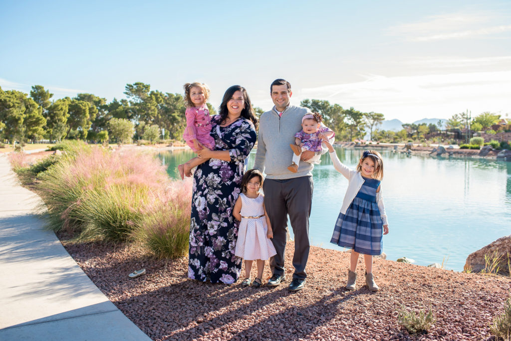
Sometimes the color mania can feel overwhelming–and before you know it you have 6 colors you want to incorporate (I know because this is 100% me). I recommend trying to stick with 2-3 colors that complement each other, and maybe 1 accent color. You’ll be surprised what limiting yourself does to simplify the process of coordinating outfits!
Bring in a little Contrast
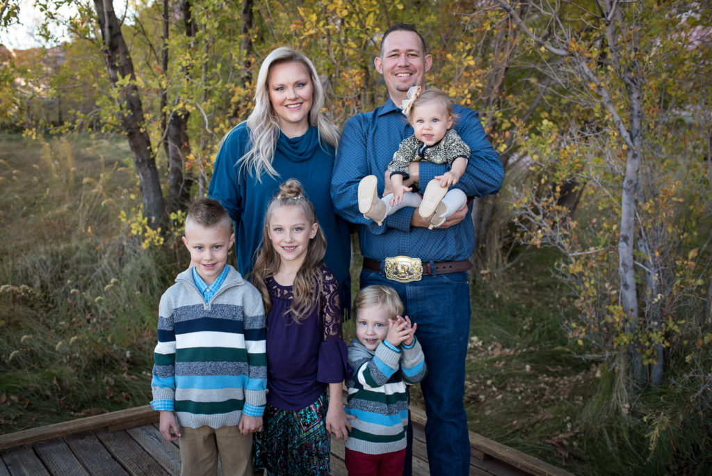
One of the biggest mistakes I see is group photos where everyone is in a black or white shirt. Varying colors bring life and variety to your pictures and allow to better display personalities.
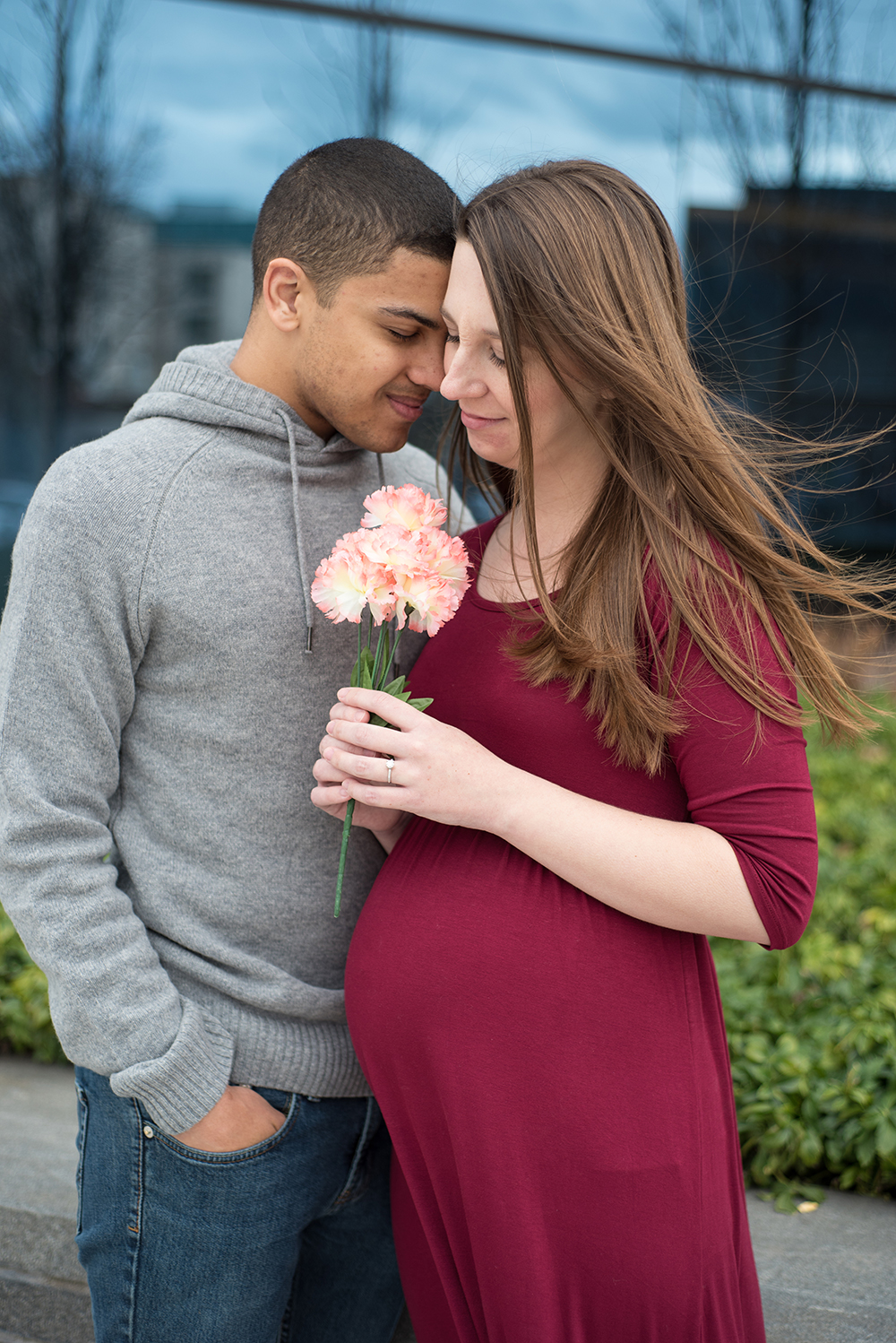
I always recommend that couples or families wear shirts that are contrasting in nature. For example—for the maternity session below, I recommended that the husband wear a lighter color gray, as I knew that the wife’s dress would be a maroon/wine colored dress. That way there is contrast between them, and they don’t blend into each other.
Avoid Patterns and Distracting Logos–Instead Add Texture
Avoid checkered/thick-striped patterns and logos—try to stick to solids or small patterns. Say NO to the plaid polo. These types of patterns tend to distract from the face, as well as can cause light to be warped in odd ways.
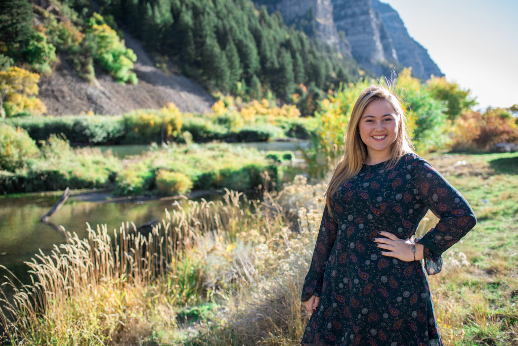
Smaller prints on shirts (like little flowers as a print on a blouse) tend to be okay in moderation. Too many or too big of prints can make clothing too busy and take away from the important part of the photo–YOU.
Instead, you can add details and dimension to clothing by choosing pieces with texture: lace, embroidery, ruffles, etc. This not only brings interest into the photo but helps create a sense of depth with the play of light and shadows on the textures.
Dressing for Confidence and to Show Your Best Self
Sometimes, it takes a little self-discovery to best understand how clothing can complement you. Below are a few things to look into as you are planning what to wear for your professional photo session.
Skin Tone
Dress for your skin tone! Although the corals may be in, it might not complement your skin tone the best. Rather find colors that show how beautiful and stunning you are.
To learn more about dressing for your skin tone, check out this article: http://stylecaster.com/how-to-dress-for-your-skin-tone/ .
Body Types
It has long been discussion among women to dress for your body type—and always a debate on what your body type is. Rather than becoming the fashion expert, I wanted to share a couple of links to blog posts that may help below. But I always remember—show off my assets and the parts of your body that you like (it almost always will make you feel more confident).
https://www.stylecraze.com/articles/right-clothes-for-body-type/
https://blog.stitchfix.com/fashion-tips/find-fit-for-your-body-type/
Darker or Lighter Colors for your Skin Tone/Body Type
Should you go with darker colors or lighter? Keep in mind that:
- Darker colors tend to slim
- White will not slim, but looks simple and fresh
- White and super light pastels will make pale skin look even pale
Bring the Attention Back to Your Face
 Sometimes, the little things are what take the attention away from your best feature–your face! Large, flashy accessories may feel stylistic but can easily overpower the face and draw attention away.
As well, remember that the more flesh you show, the less people are drawn to your face because there is less contrast between skin and clothing. I will never say you can’t wear short sleeves/sleeveless tops or shorts and short dresses (that is totally fine), but just be aware that if you really want your faces to pop, you’ll want to show less flesh so we are pulled to that coloring on your face.
Don’t forget the shoes!
Dirt-stained, worn down, tennis shoes may be the most comfortable, but may also be the downfall of a coordinated outfit. Tennis shoes may be fine but try to ensure colors and quality of the shoes match the rest of your outfit.
Now You’re Ready! Exactly How to Determine What to Wear for a Professional Photo Shoot with Lucy L Photography!
I can’t wait for our session, and excited to see what you come dressed in! If you need any further assistance or have other questions about what to wear–let me know. I want to make this photo session one for the books!